NorthMech AB is a Swedish staffing company aiming for skilled mechanic workers who are willing to work. My task during this project was to come up with a strong and unique identity mark that will suit this industry fluently.
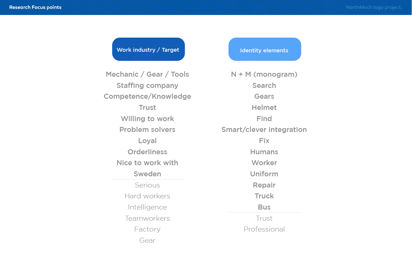
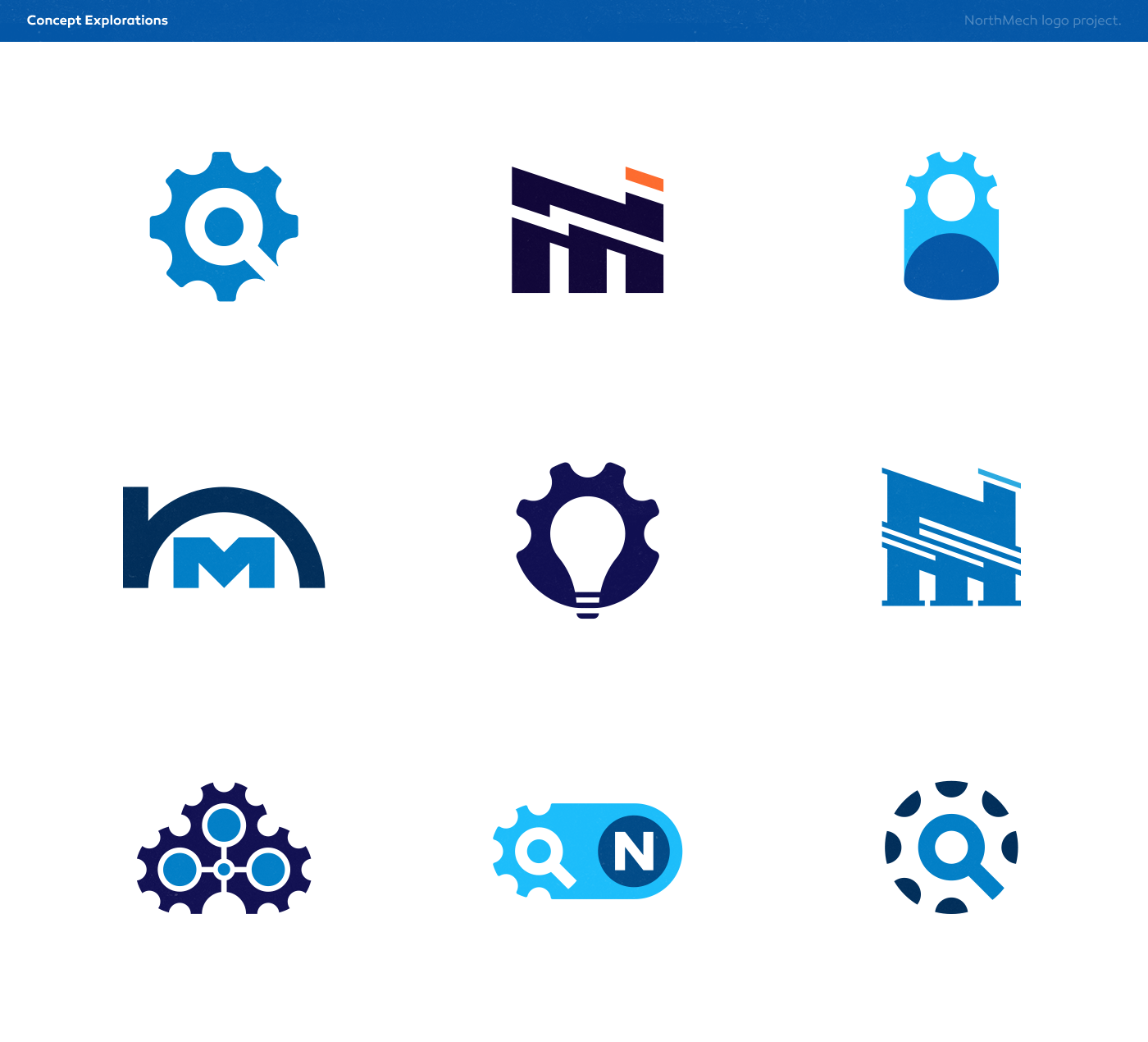
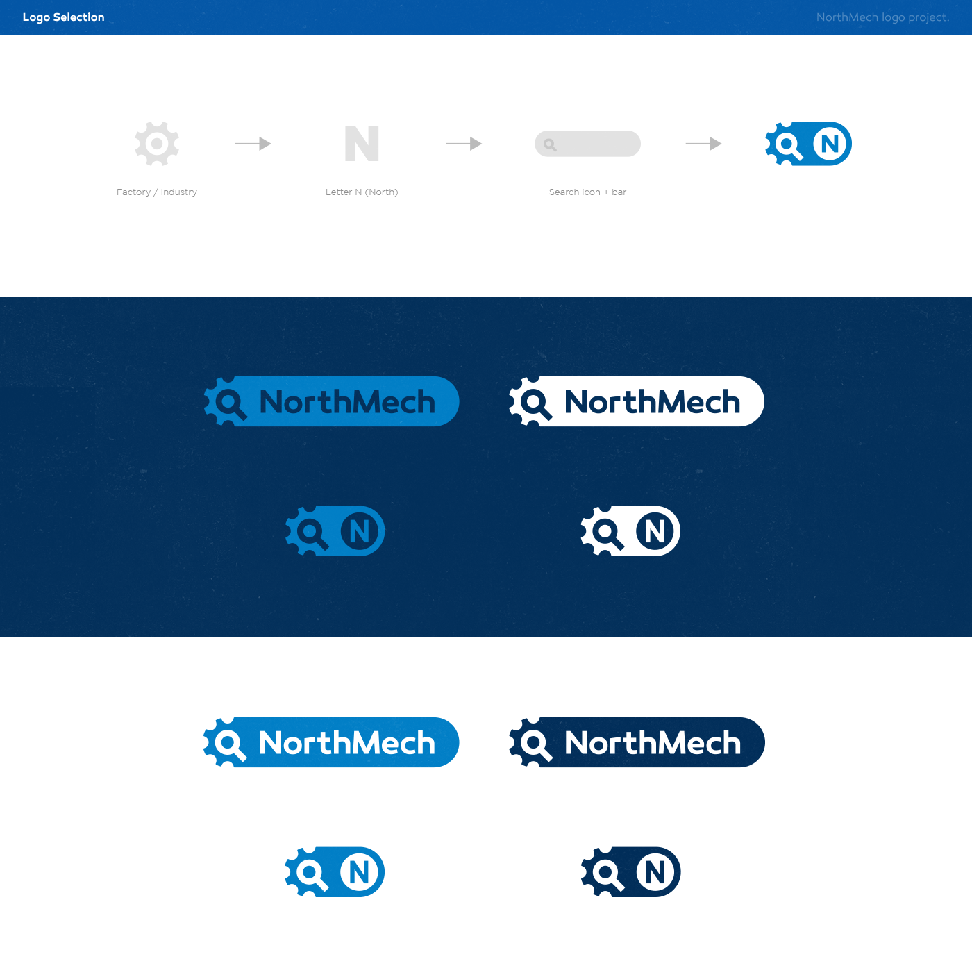
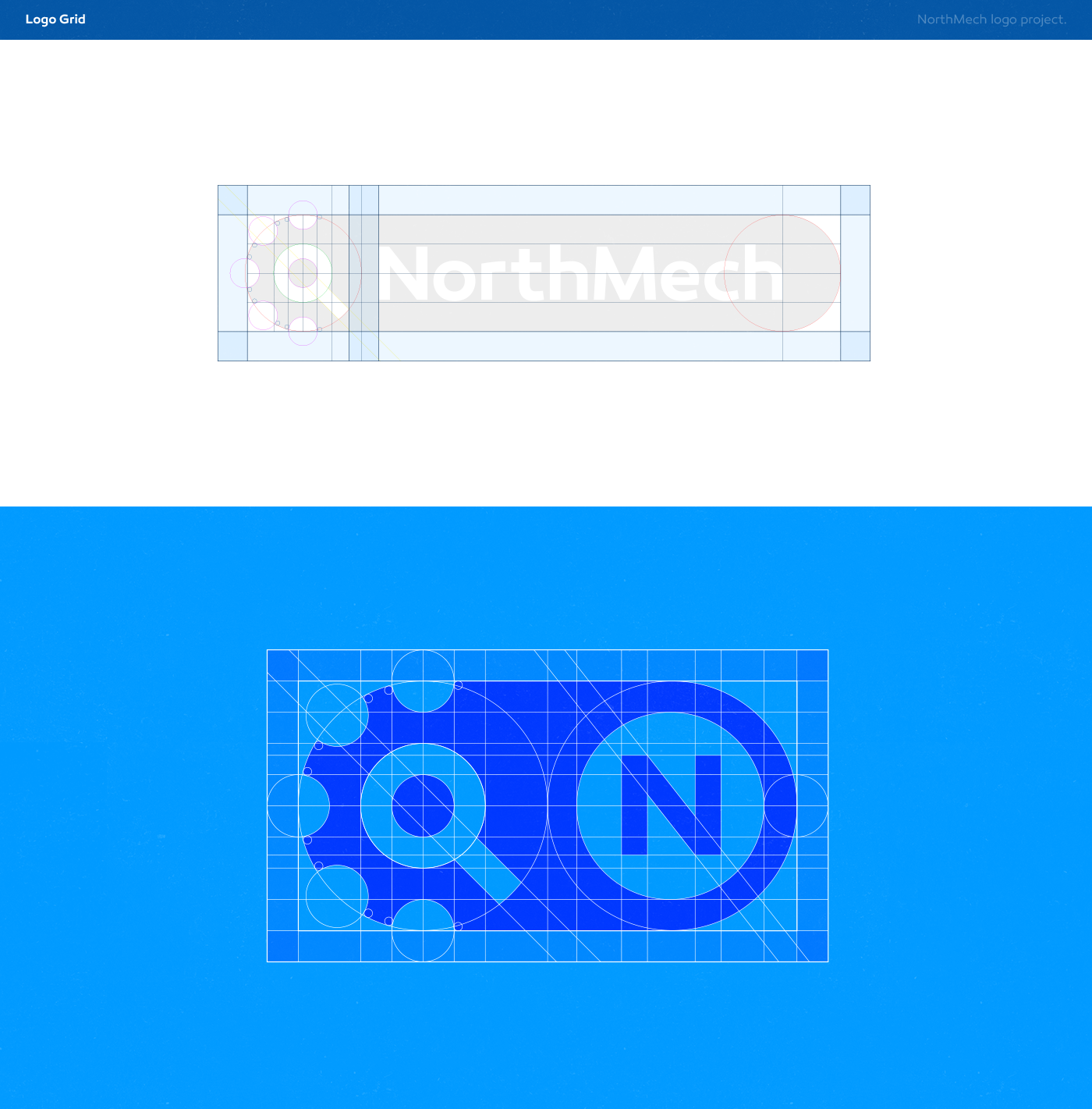
As I'm always look for 'smart' elements to include in my logos, I've been searching for the right and most relevant elements to include in each concept proposal during this project. In the below 'Research Focus Points' I collected all the first ideas that came to mind and after reading the briefing to understand what my client thinks is important to make me aware of. But also what I think would be interesting to include. I often prefer a letter monogram mixed with one (or two) specific element(s) that the company/service provides. Or two suitable elements that go very well together without trying too hard (because less is always more). But this all depends on each project as they are all unique. In this case study I try to explain my design processes and decisions step-by-step and show you how I got to my final logo design for this project.